Analytics Pro SAAS Dashboard

Case Study — Analytics Pro Dashboard

Overview

Analytics Pro is a conceptual SaaS dashboard designed to help businesses track sales, orders, and customers in a clear and professional way.

The challenge was simple: dashboards often feel cluttered, making it hard to know what really matters. My goal was to design an experience where every page answers a business question at a glance.

Dashboard

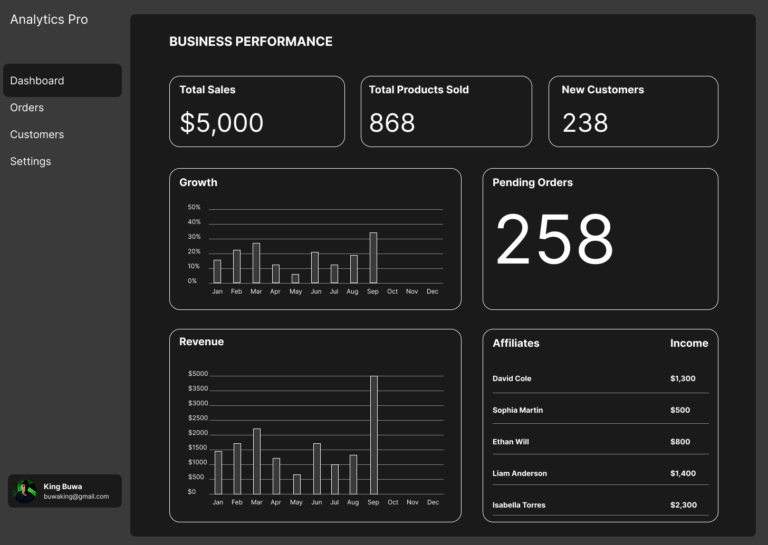
On the landing page, I highlighted the four most important metrics: Total Sales, Products Sold, New Customers, and Pending Orders.

  • These numbers are animated to create a sense of “live” data.
  • Growth and Revenue charts show patterns over time instead of isolated numbers.
  • The Affiliates section highlights partner contributions, a key driver for many businesses.


This page gives leaders a pulse check: are we growing, selling, and retaining customers?

Orders

For the Orders page, I swapped in metrics that matter to operations: Pending, Completed, and Cancelled Orders.

  • A detailed table shows who ordered what, how much they spent, and the status of each order.
  • An “Orders Over Time” chart reveals peak periods.
  • A “Most Sold Items” list highlights product demand.


This design helps businesses spot bottlenecks, reduce delays, and double down on bestsellers.

Customers

Here, I focused on Total, New, and Returning Customers to capture growth and loyalty.

  • The table provides individual profiles: orders, spend, and join date.
  • A monthly chart tracks acquisition trends.
  • A pie chart highlights top spenders — the customers who drive the most value.


This page makes it easy to balance acquisition vs retention and strengthen relationships with high-value customers.

Settings

Settings are about control and trust.

  • Profile and Preferences allow personalization (dark mode, notifications).
  • Security settings (password reset, 2FA) show reliability.
  • System info adds transparency.
  • Subscription details (plan, billing, payment method) make the product feel like a real SaaS tool.


These elements reassure users that the dashboard is secure, professional, and worth paying for.

Project Conclusion

Designing Analytics Pro taught me the importance of:

  • Contextual metrics — each page focuses only on what matters most for that task.
  • Visual hierarchy — bold numbers up top, supporting data below.
  • Business alignment — every design choice ties back to growth, efficiency, or trust.

This project shows I can design data-heavy interfaces that stay simple and actionable.

Scroll to Top